
- Accessible Forms
- Website Accessibility
Accessible Forms: WCAG Requirements, Labels, Errors & Fixes
WCAG requires every form field to have a programmatic label, clear error messages, and keyboard operability. Learn the exact criteria, common failures, and code-level fixes for accessible forms.
Quantity Discounts
Price per course
6 to 20 courses
$20.95
21 to 50 courses
$17.95
51 to 200 courses
$13.95
201+ courses
Custom offer
Forms are where users do the most important things on your website: registering, checking out, applying, booking, contacting, logging in. They are also where the most consequential accessibility failures occur. A screen reader user who cannot identify a form field cannot complete a purchase. A keyboard user who cannot navigate a custom dropdown cannot select their province.
Form accessibility failures appear in the top six WCAG violations year after year. This guide covers every WCAG criterion that applies to forms, what each requires in plain language, and the exact code patterns that pass or fail.
WCAG Criteria Covering Forms: Overview
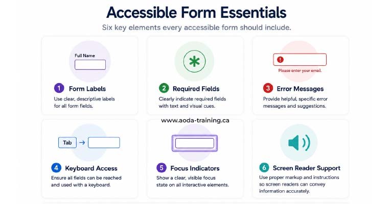
Nine success criteria govern form accessibility across WCAG 2.0, 2.1, and 2.2. Seven apply directly under AODA’s WCAG 2.0 Level AA requirement. Two are WCAG 2.2 additions not yet legally required in Ontario but widely tested in modern audits.
| Criterion | Level | Plain-language summary | WCAG version |
|---|---|---|---|
| 1.3.1 Info and Relationships | Level A | Labels, fieldset groupings, and required indicators must be programmatically determinable — not conveyed by visual styling alone | 2.0 |
| 1.3.5 Identify Input Purpose | Level AA | Personal data fields must use autocomplete attributes so browsers and assistive tech can identify their purpose | 2.1 |
| 1.4.1 Use of Colour | Level A | Required fields and errors must not be communicated by colour alone — a text indicator must also be present | 2.0 |
| 2.1.1 Keyboard | Level A | All form fields and controls must be operable by keyboard — no mouse-only date pickers or hover-only tooltips | 2.0 |
| 3.3.1 Error Identification | Level A | When errors are detected, each must be identified in text and described to the user | 2.0 |
| 3.3.2 Labels or Instructions | Level A | Every input must have a visible label; placeholder text alone does not satisfy this | 2.0 |
| 3.3.3 Error Suggestion | Level AA | When an error is detected and a correction is known, the suggestion must be provided | 2.0 |
| 3.3.4 Error Prevention | Level AA | Legal, financial, or data-deletion submissions must be reversible, checkable, or confirmable | 2.0 |
| 3.3.7 Redundant Entry | Level A | Users must not be asked to re-enter information already provided in the same session | WCAG 2.2 |
| 3.3.8 Accessible Authentication | Level AA | Login must not require solving puzzles or recalling passwords without an accessible alternative | WCAG 2.2 |
| 4.1.2 Name, Role, Value | Level A | Every form control must have an accessible name, correct role, and programmatically exposed state | 2.0 |
The Key Criteria in Detail
Visual relationships — a label above an input, a box around radio buttons — are invisible to assistive technology unless expressed in HTML structure. Labels must be programmatically associated with their fields. Related inputs must be grouped with <fieldset> and <legend>. Required field indicators must use text or ARIA, not only asterisk styling.
<label for="email">Email address</label>
<input type="email" id="email" required>
<p>Email address</p>
<input type="email">
Screen reader: "edit text, blank"
Every input must have a visible, persistent label. Placeholder text fails this criterion: it disappears when typing begins, cannot reliably meet contrast requirements, and is not consistently announced by screen readers as a field label.
<label for="phone">Phone number</label>
<input type="tel" id="phone"
  placeholder="e.g. 4165550123">
<input type="tel"
  placeholder="Phone number">
Label disappears on input.
When errors are detected, each must be identified in text and described. When the system knows what the correct input should be, the error message must say so. "Invalid input" fails both criteria. The error must be programmatically linked via aria-describedby, and aria-invalid="true" set on the input in error. Colour alone — a red border — is never sufficient.
aria-describedby="email-error"
aria-invalid="true"

<span id="email-error">
Enter a valid
email, e.g.
name@domain.com
</span>
Border turns red.
No text error message.
No aria-invalid.

Screen reader gets no feedback.
Every form control must expose its accessible name (so screen readers can identify it), the correct semantic role (so screen readers know what kind of control it is), and its current state: required, invalid, disabled, checked, or expanded. Native HTML elements provide name, role, and state automatically when used correctly. Custom controls built with non-semantic HTML must add explicit ARIA.
role="combobox"
aria-expanded="false"
aria-labelledby="lbl"
aria-required="true"
aria-invalid="true"
<div class="dropdown">...</div>

No role,
no accessible name,
no state.

Screen reader reads
plain text only.
Form Labels: The Four Techniques
There are four HTML patterns that create a valid programmatic association between a label and its input. The first two are preferred — they require no ARIA and work reliably across all browsers and assistive technologies.
The <label> element's for attribute matches the input's id. Clicking the label moves focus to the input.
<label for="email">Email address</label>
<input type="email" id="email">
<p>Email address</p>
<input type="email">

No association created.
Wrapping the input inside the <label> creates an implicit association without needing for and id.
<label>Email address
  <input type="email">
</label>
<div>Email address
  <input type="email">
</div>

A div creates no association.
When a visible label cannot be provided — such as a search field where an icon provides visual context — aria-label names the element directly. Use sparingly; visible labels are always preferred.
<input type="search"
  aria-label="Search the site"
  placeholder="Search...">
<input type="search"
  placeholder="Search...">

Placeholder alone is not a label.
aria-labelledby references the id of any existing visible text on the page to serve as the input's label. Useful for table-based layouts where a column or row header serves as the label.
<h2 id="qty-heading">Quantity</h2>

<input type="number"
aria-labelledby="qty-heading">
<h2>Quantity</h2>

<input type="number">

No association.

"number input, blank"
Grouping Related Fields: fieldset and legend
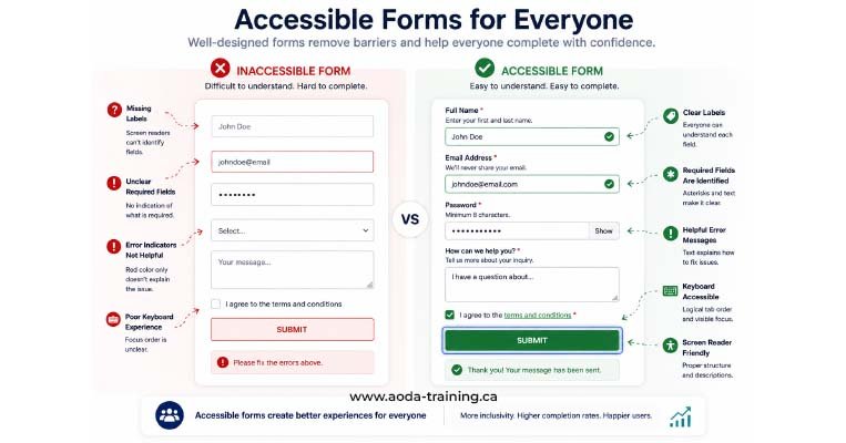
Any group of two or more radio buttons or checkboxes representing options for a single question must be wrapped in <fieldset> and <legend>. The legend provides the group’s accessible name, prepended to each field’s label by screen readers.
<fieldset>
  <legend>Preferred contact method</legend>

  <label>
    <input type="radio"
           name="c"
           value="email">
    Email
  </label>

  <label>
    <input type="radio"
           name="c"
           value="phone">
    Phone
  </label>

</fieldset>

Screen reader:
"Preferred contact method,
Email,
radio button,
1 of 2"
<p>Preferred contact method</p>

<label>
  <input type="radio">
  Email
</label>

Screen reader:
"Email,
radio button,
1 of 2"

The question being
answered is lost.
role="group" and aria-labelledby is technically valid but less consistently supported across screen reader and browser combinations. Use native fieldset/legend.Accessible Error Messages: The Complete Pattern
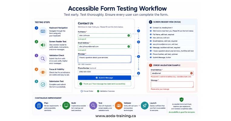
An accessible error implementation has three components: an error summary at the top of the form listing all errors on submission failure; inline error messages beneath each failed field; and programmatic connections via aria-describedby so screen readers announce the error when the field is focused.
Component 1 — Error summary (move focus here on submission failure)
<div role="alert" id="error-summary" tabindex="-1">
  <h2>There are 2 errors in this form</h2>

  <ul>
    <li>
      <a href="#email">
        Email: Please enter a valid email address
      </a>
    </li>

    <li>
      <a href="#phone">
        Phone: Please enter a 10-digit number
      </a>
    </li>
  </ul>

</div>
Component 2 — Inline error beneath each field
<label for="email">Email address</label>

<input type="email" id="email"
  aria-describedby="email-error"
  aria-invalid="true"
  required>

<span id="email-error" class="error-msg">
  Please enter a valid email address
  (example: name@domain.com)
</span>
aria-live="polite" so announcements are non-disruptive.Required Fields: The Three-Part Implementation
Marking a field as required must be done three ways simultaneously to satisfy SC 1.3.1, 1.4.1, and 4.1.2: visually, in text, and programmatically.
| Requirement | Implementation | Criterion satisfied |
|---|---|---|
| Visual indicator | Asterisk (*) or the word 'Required' adjacent to the label | Communicates requirement to sighted users |
| Text explanation | A note near the top of the form: 'Fields marked with * are required' | SC 1.4.1: asterisk not communicated by colour alone; text explains the symbol |
| Programmatic attribute |
required
attribute on the
<input>
, or
aria-required="true"
for custom controls
|
SC 4.1.2: screen readers announce 'required' on focus; SC 1.3.1: the relationship is in the markup |
| Label inclusion (best practice) |
Include '(required)' in the
<label>
text, e.g.
'Email address (required)'
|
Ensures announcement regardless of whether the browser exposes the required attribute |
Autocomplete: SC 1.3.5 and What It Requires
WCAG 1.3.5 — Identify Input Purpose — requires that fields collecting personal information use the HTML autocomplete attribute with the correct token value. This allows browsers and assistive technologies to identify the field’s purpose and offer autofill, reducing the typing burden for users with motor and cognitive disabilities.
| Field type | Correct autocomplete value |
|---|---|
| Full name |
name
|
| First name |
given-name
|
| Last name |
family-name
|
| Email address |
email
|
| Phone number |
tel
|
| Street address line 1 |
address-line1
|
| City |
address-level2
|
| Province / State |
address-level1
|
| Postal / ZIP code |
postal-code
|
| Country |
country-name
|
| Credit card number |
cc-number
|
| New password (registration) |
new-password
|
| Current password (login) |
current-password
|
| One-time code |
one-time-code
|
autocomplete="off" is almost always the wrong choiceautocomplete="off" prevents the browser autofill and input purpose identification that SC 1.3.5 requires. Only disable autocomplete where autofill would genuinely create a security risk in context. Fields collecting personal data for the user’s own account should always support autocomplete.Most Common Accessible Form Failures in Ontario Websites
| Failure | WCAG criterion | Fix |
|---|---|---|
| Placeholder text used as the only label | 3.3.2 (A) |
Add a visible
<label>
element; placeholder can remain as a supplementary hint
|
| Radio button group has no fieldset/legend | 1.3.1 (A) |
Wrap all related radio buttons in
<fieldset><legend>
|
| Error messages not linked to fields | 3.3.1 (A), 4.1.2 (A) |
Add
id
to each error message;
add
aria-describedby
on the input;
set
aria-invalid="true"
on error
|
| Required fields marked only by red colour or asterisk | 1.3.1 (A), 1.4.1 (A) |
Add
required
attribute;
add text explanation of the asterisk;
include
(required)
in or near the label
|
| Generic error messages ('Invalid input') | 3.3.3 (AA) | Write messages that name the field, describe the problem, and state the required format |
| Error summary not announced on submission failure | 3.3.1 (A) |
Add
role="alert"
to the error summary and move focus to it on submission failure
|
| Custom dropdown has no ARIA role or accessible name | 4.1.2 (A) |
Add
role="combobox",
aria-expanded,
aria-labelledby,
and keyboard handlers;
or replace with native
<select>
|
| Date picker requires mouse to operate | 2.1.1 (A) | Use a keyboard-accessible date picker; always allow direct text entry as an alternative |
| Paste blocked in password or authentication fields | 3.3.8 (AA, WCAG 2.2) | Remove paste prevention; password managers are a legitimate accessibility tool, not a security risk |
| Billing address re-entry required after shipping entry | 3.3.7 (A, WCAG 2.2) | Add 'Same as shipping address' checkbox; auto-populate billing fields with shipping data |
Frequently asked questions
Can placeholder text replace a label?
- No. Placeholder text fails WCAG 3.3.2 because it disappears when typing begins, its default grey colour typically fails the 4.5:1 contrast ratio of SC 1.4.3, and it is not consistently announced as a label by screen readers. Every input must have a persistent visible label. Placeholder may optionally supplement it to show an example format.
Do I need fieldset and legend for every group of checkboxes?
- Yes, for any group of two or more checkboxes representing options for a single question. A single standalone checkbox — such as “I agree to the terms” — does not need a fieldset if its label clearly identifies its purpose. Multi-option groups always require a fieldset with the question as the legend.
What is the difference between aria-label and aria-labelledby?
aria-labelprovides an accessible name as a string directly on the element — used when no visible text can serve as the label.aria-labelledbyreferences the id of an existing visible element whose text becomes the accessible name; it is preferred when visible text exists because the accessible name stays in sync automatically. Visible labels with<label>elements are always the first choice.
Should inline validation fire while the user is typing?
- No. Per-keystroke validation disrupts screen reader users with constant live region announcements. Validate on blur (when focus leaves a field) or on form submission. For real-time feedback such as password strength, use
aria-live="polite"and treat the feedback as supplementary, not the sole error notification.
How do I make a custom dropdown accessible?
- Use a native
<select>wherever possible — keyboard accessible, screen reader compatible, and mobile friendly by default. If a custom dropdown is required, implement the ARIA combobox pattern:role="combobox"on the trigger,aria-expandedfor open/closed state,aria-labelledbyfor the label,role="listbox"androle="option"on the options, and keyboard support for arrow keys, Enter, and Escape. Test across NVDA, JAWS, and VoiceOver.
Empower Your Team with Digital Accessibility
Ensure compliance, reduce legal risks, and build inclusive digital experiences.
Start AODA training for your team →Get Your Forms Audited for WCAG Compliance
Form accessibility failures are partially detectable by automated tools — missing label associations, absent required attributes, and unlabelled custom controls appear in scan results. But error handling, validation timing, focus management, and error message quality require manual testing by a specialist navigating forms with a keyboard and screen reader.
- Automated scan of all forms for missing labels, absent fieldset/legend, and unlabelled custom controls
- Keyboard-only completion of every form: tab order, field activation, error navigation, and submission
- Required field implementation: visual indicator, text explanation, required attribute, and label text
- Custom control review: dropdowns, date pickers, toggles, and sliders tested for ARIA correctness
- Manual screen reader testing with NVDA + Firefox: label, error, and required field announcement
- Error handling review: summary focus management, inline messages, aria-describedby, aria-invalid state
- Autocomplete attribute audit: all personal data fields checked against SC 1.3.5 token requirements
- WCAG 2.2 additions: redundant entry check; paste permission in authentication fields; CAPTCHA alternatives