
- Colour Contrast & WCAG
- Website Accessibility
Colour Contrast & WCAG: Requirements, Ratios, and How to Test
WCAG requires 4.5:1 contrast for normal text, 3:1 for large text and UI components. Learn the exact rules, what is exempt, how to test, and how to fix failures.
Quantity Discounts
Price per course
6 to 20 courses
$20.95
21 to 50 courses
$17.95
51 to 200 courses
$13.95
201+ courses
Custom offer
The Three Contrast Ratios You Need to Know
Contrast is measured as a ratio between the relative luminance of a foreground colour and its background. The scale runs from 1:1 (identical colours, zero contrast) to 21:1 (pure black on pure white). WCAG defines three thresholds. For AODA compliance, the two Level AA ratios below are mandatory for Ontario organizations.
#00205B on #FFFFFF — excellent
#595959 on #FFFFFF — AA and AAA large text
#AAAAAA on #FFFFFF — typical placeholder fail
#D80621 on #fdf0ef — common design fail
The WCAG Criteria That Cover Colour Contrast
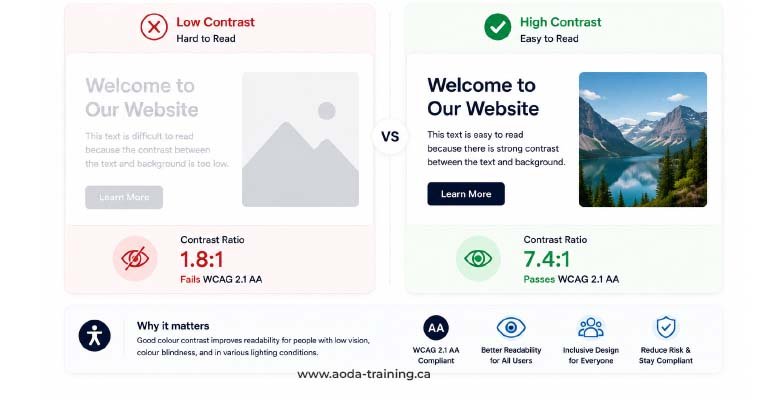
Three success criteria govern colour contrast in WCAG. Two are Level AA and are required under AODA. One is Level AAA, not legally required, but increasingly expected by public sector clients and accessibility auditors.
#00205B) on white (#FFFFFF) achieves approximately 14:1 — well above the 4.5:1 minimum. Bold 20px heading in mid-grey (#595959) on white achieves 7:1, passing large-text requirements.
#AAAAAA) on white achieves only 2.3:1. Mid-blue text (#4A90D9) on light blue (#D6EAFF) achieves approximately 2.8:1, failing even the large-text threshold.
#000000) body text on white achieves 21:1. Near-black (#1C1C1C) on white achieves approximately 18.1:1 — AAA compliant with a slightly warmer appearance.
#595959) on white at 7:1 passes AA but sits right at the AAA boundary for normal text. Any body text lighter than approximately #595959 on white fails AAA.
#767676 on white, achieving 4.5:1 — well above the 3:1 minimum. A custom checkbox has a visible dark outline at 4.2:1 against the page background.
#E0E0E0) on white, achieving only 1.6:1 — the field boundary is invisible to many users with low vision. A bar chart uses pastel colours below 2:1 against the white background.
What Counts as Large Text
The distinction between ‘normal text’ and ‘large text’ determines which ratio applies. WCAG’s definition is precise and commonly misunderstood — large text is not simply ‘big enough to read easily.’
| Text type | Minimum size | Font weight | Contrast ratio required (AA) |
|---|---|---|---|
| Large text | 18pt (approx. 24px) | Any weight (regular or bold) | 3:1 |
| Large text — bold variant | 14pt (approx. 18.66px) | Bold only | 3:1 |
| Normal text | Any size below the thresholds above | Any weight | 4.5:1 |
What Is Exempt From Contrast Requirements
Not every element on a page must meet a contrast ratio. WCAG defines four explicit exemptions under SC 1.4.3. Understanding these prevents over-reporting in audits and helps teams prioritize correctly.
| Exemption | What qualifies | Common example |
|---|---|---|
| Decorative text | Text that conveys no information and that removing or changing would not affect page content | A purely visual watermark or background pattern containing repeated text |
| Incidental text | Text in photographs or images where the text is not the focus and is not needed to understand the content | A street sign visible in the background of a lifestyle photo |
| Logotypes | Text that forms part of a logo or brand name | The wordmark inside your company logo image or SVG |
| Inactive UI components | UI controls that are disabled and not interactive | A greyed-out 'Continue' button before a required form field is completed |
Text on Images, Gradients, and Patterned Backgrounds
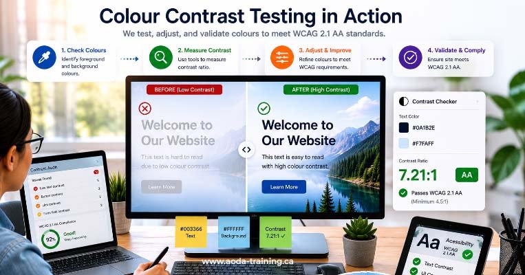
Text placed over images, gradients, or patterned backgrounds is one of the most common sources of contrast failures in professionally designed websites. The contrast must be measured against the actual colour behind each letter — not an average of the background.
Hero Sections with Text Overlaid on Photography
A dark semi-transparent overlay placed between a photograph and white text is the standard technique for meeting contrast requirements in hero sections. The overlay must be dark enough that the resulting blended colour behind the text achieves 4.5:1 against the text — the photograph itself is irrelevant to the measurement.
Gradient Backgrounds Behind Text
When text sits on a gradient, the contrast must be evaluated at the point where contrast is lowest — not where it is highest. If a heading transitions from a dark left edge to a light right edge, the measurement is taken at the lightest point behind any character. If the worst-case point fails, the entire element fails.
White or Light Text on Coloured Buttons
White text on a coloured button is a common design pattern that frequently fails. A mid-blue (#4472C4) button with white text achieves only 3.2:1 — passing for large text but failing for normal-sized button labels. Darkening the button to #2E5C9E achieves 5.1:1.
The Link Contrast Problem: Three Colours, Two Pairs
Inline links within body text must meet contrast requirements in two directions simultaneously: the link colour against the page background (4.5:1), and the link colour against the surrounding body text (3:1 — or the link must be underlined, making colour distinction unnecessary).
| Pair being tested | Required ratio | Why |
|---|---|---|
| Link text vs. page background | 4.5:1 (or 3:1 if large text) | SC 1.4.3 — the link text must be readable against its background |
| Link text vs. surrounding body text | 3:1 | SC 1.4.1 — if colour is the only way to distinguish the link from body text, that colour difference must be perceptible |
| Link text vs. page background on hover/focus | Same ratios as above | All interactive states must also pass — not just the default state |
How to Test Colour Contrast
Contrast testing combines automated scanning for straightforward cases and manual measurement for complex ones (text on images, gradients, or custom component states). No automated tool catches every contrast failure — manual testing is always required for a complete audit.
How to Fix Colour Contrast Failures
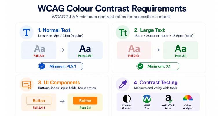
Step 1 — Audit all colour pairs in your design system
Run the WebAIM Contrast Checker against every colour combination in your design system: body text on each background, heading colours, link colours in each state, button label on button background, input text on input background, placeholder text, helper text, error text, icon colours. Fix failures at the design system level and every instance inherits the fix automatically.
Step 2 — Adjust hue, not just lightness
Darkening a failing colour is the obvious fix, but it can break brand alignment. Shifting the hue slightly toward blue or purple often allows a darker value while remaining recognisably within the brand palette. Use tools like Accessible Colour Palette Builder (venngage.com) to find accessible variants of existing brand colours.
Step 3 — Check all interactive states
A colour that passes in the default state may fail on hover, focus, or active states. Test every state independently: default, hover, focus (keyboard), active (pressed), and visited (for links). Each state’s colour pair must independently meet the required ratio.
Step 4 — Address text on images last, systematically
Options in order of accessibility reliability: (1) add a sufficiently dark or light solid overlay behind the text; (2) apply a text shadow with adequate opacity; (3) place text inside a solid-colour container over the image; (4) replace the image with one where the area behind text is sufficiently uniform.
Most Common Colour Contrast Failures in Ontario Websites
| Failure pattern | Typical cause | Fix |
|---|---|---|
| Light grey placeholder text in form fields |
Placeholder set to #999 or #AAAAAA (2.3:1 against white)
|
Darken to at least #767676 (4.5:1) or use a persistent visible label instead
|
| White text on mid-tone coloured buttons | Brand button colour too light for 4.5:1 against white text | Darken the button background or switch to dark text if button colour cannot change |
| Low-contrast footer text | Light text on mid-grey background for stylistic effect |
Test the actual footer colour pair — white on #6B6B6B achieves only 3.1:1, a fail for normal text
|
| Hyperlinks indistinguishable from body text | Link colour matches body text; underline removed via CSS | Restore underlines or choose a link colour achieving 3:1 against body text AND 4.5:1 against the page background |
| Disabled-looking but active UI elements | Greyed-out styling applied to active form fields for aesthetic reasons | Disabled exemption only applies to genuinely inactive elements — active elements must meet 4.5:1 |
| Text on hero image with no overlay | White headline placed directly over a landscape photograph | Add a semi-transparent dark overlay at sufficient opacity, or measure contrast at every background region behind the text |
| Thin icon outlines on white backgrounds | Icon uses a single-pixel stroke in a brand colour below 3:1 (SC 1.4.11) | Thicken or darken the stroke, or add a solid background area to the icon |
Frequently asked questions
What contrast ratio does AODA require?
- Ontario’s AODA references WCAG 2.0 Level AA, which requires a 4.5:1 contrast ratio for normal text (under 18pt regular or 14pt bold) and 3:1 for large text. These ratios come from WCAG Success Criterion 1.4.3. The 3:1 ratio for non-text UI components (SC 1.4.11) is a WCAG 2.1 requirement and is not strictly part of the AODA obligation, but is expected in modern audits.
Does my logo need to meet contrast requirements?
- No. Text that is part of a logo or brand name is explicitly exempt from WCAG’s contrast requirements under SC 1.4.3. Your company wordmark does not need to pass a contrast ratio check. However, if your logo appears on a coloured background in the page header, other page elements nearby — navigation links, headings — still must meet their own contrast requirements.
Do disabled buttons need to meet contrast ratios?
- No. Inactive user interface components that are visually disabled and not interactive are exempt from SC 1.4.3 and SC 1.4.11. However, this exemption applies only to genuinely disabled controls. If a button appears greyed out but is still clickable, it is an active component and must meet the full contrast requirements. A common audit failure is applying a disabled visual style to an active element for aesthetic reasons.
Is a 3:1 ratio good enough for body text?
- No. A 3:1 ratio is only sufficient for large text (18pt+ regular or 14pt+ bold). Normal-sized body text — most paragraph text on websites — requires 4.5:1 at Level AA. A common error is testing body text against the large-text threshold and reporting a pass. Always check whether the text qualifies as large text before applying the lower ratio.
Does colour contrast apply to placeholder text in form fields?
- Yes. Placeholder text is visible text rendered inside a form field before the user enters a value. It must meet the same 4.5:1 ratio as any other normal-sized text. The default browser placeholder colour (
#AAAAAAon white, approximately 2.3:1) fails WCAG 1.4.3. Placeholder text should be darkened, or — better practice — use a persistent visible label above the field and either remove the placeholder or use it for supplementary hints only.
How do I test contrast on text overlaid on a photo?
- Use the TPGi Colour Contrast Analyser, which includes an eyedropper that picks colours from anywhere on your screen including rendered web pages. Navigate to the page in your browser, open the tool, use the foreground eyedropper to pick a pixel of the text colour, and use the background eyedropper to pick the background colour directly behind that text. Test multiple positions if the background colour varies. The lowest ratio you find is the effective contrast of that element.
What about contrast for focus indicators?
- Under WCAG 2.1, focus indicators are covered by SC 1.4.11 (Non-Text Contrast), requiring 3:1 against adjacent colours. In WCAG 2.2, SC 2.4.11 and SC 2.4.13 introduce additional requirements for focus indicator size and contrast. If building to WCAG 2.2, focus indicators need a 3:1 contrast ratio change between focused and unfocused states, using a focus area meeting minimum size requirements.
Empower Your Team with Digital Accessibility
Ensure compliance, reduce legal risks, and build inclusive digital experiences.
Start AODA training for your team →Get a Full Colour Contrast Audit for Your Website
Automated scanning finds roughly a third of contrast failures. The rest — text on images, gradient backgrounds, interactive states, SVG icons, and canvas elements — require manual testing. Our WCAG compliance audit covers every contrast criterion with automated tools and manual eyedropper testing.
- Automated scanning with axe DevTools and WAVE for SC 1.4.3 and SC 1.4.11 failures
- All interactive states: default, hover, focus, active, visited, and disabled
- Navigation elements: primary nav, breadcrumbs, footer links, and skip links
- Manual eyedropper testing of text on images, gradients, and patterned backgrounds
- Form field elements: input text, placeholder, labels, error messages, helper text
- Prioritized findings with exact colour values, current ratio, required ratio, and specific fix