
- Keyboard Navigation Accessibility
- Website Accessibility
Keyboard Navigation Accessibility: WCAG Requirements & Fixes
WCAG requires all website functionality to be operable by keyboard alone. Learn the exact criteria, the most common failures — focus traps, missing skip links, invisible focus — and how to fix them.
Quantity Discounts
Price per course
6 to 20 courses
$20.95
21 to 50 courses
$17.95
51 to 200 courses
$13.95
201+ courses
Custom offer
Who Relies on Keyboard Navigation

Keyboard accessibility is not just about users with motor disabilities. Every screen reader user navigates by keyboard. Getting keyboard access right is the single most impactful thing a development team can do to improve real-world accessibility.
The WCAG Criteria Covering Keyboard Navigation
Six success criteria govern keyboard accessibility across WCAG 2.0, 2.1, and 2.2. Four are Level A — the mandatory minimum — and two are Level AA. All six apply to organizations meeting WCAG 2.0 Level AA under AODA.
tabindex="-1".
display:none). The skip link target is incorrect and focus lands in the wrong location.
outline: none or outline: 0) without providing an equally visible custom alternative is a direct WCAG failure.
outline: none applied globally or to :focus selectors without any replacement, making keyboard focus invisible across the entire site.
scroll-padding-top is set to account for the sticky header height.
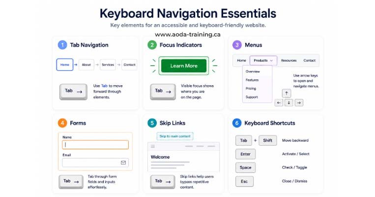
Standard Keyboard Controls Every Website Must Support
These are the keyboard interactions WCAG requires interactive elements to respond to. Testing these manually is the fastest way to uncover keyboard accessibility failures on any website.
tabindex="0")
onclick event fires when a user clicks with a mouse OR presses Enter on a natively focusable element like <button> or <a>. But a custom <div> or <span> with an onclick handler will not respond to Enter or Space from the keyboard, even if tabindex="0" is set. Every custom interactive element built with non-semantic HTML requires explicit keydown or keypress event handlers for Enter and Space.Focus Management: Handling Dynamic Content Correctly
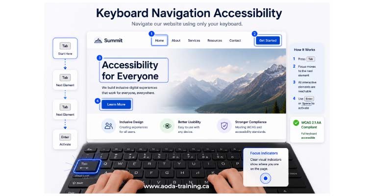
Static pages are relatively straightforward to make keyboard accessible. The harder challenge is dynamic content — modals, drawers, accordions, single-page application route changes, inline form validation, and AJAX-loaded content. Each requires deliberate focus management
Modal Dialogs and Overlay Panels
When a modal opens, focus must move into the modal immediately. Focus must cycle within the modal (Tab wraps from the last focusable element back to the first). Escape and the close button must close the modal and return focus to the element that triggered it. Background content must be made inert so screen reader users cannot navigate behind the modal.
// Correct modal focus management pattern
// On open:
const trigger = document.activeElement; // store the trigger
modal.removeAttribute('hidden');
firstFocusableInModal.focus(); // move focus in
document.body.setAttribute('inert', ''); // lock background

// On close:
modal.setAttribute('hidden', '');
document.body.removeAttribute('inert');
trigger.focus(); // return focus to trigger
Accordion and Disclosure Components
The trigger button must toggle the panel open and closed with Enter and Space. When a panel opens, focus stays on the trigger — it does not move into the panel content. Users tab into the panel content naturally. When a panel closes, focus stays on the trigger.
Single-Page Application Route Changes
When navigation occurs within a single-page app without a full page reload, focus does not automatically move to the top of the new page. The application must programmatically set focus to the page’s main heading (H1) or main content container after each route change, and announce the new page title to screen readers via a live region or document.title update.
Inline Error Messages and Validation
When a form submission fails and error messages appear, focus must move to the first error message or to an error summary at the top of the form. Users must not be left with focus at the submit button while errors appear elsewhere on the page with no keyboard path to them.
tabindex: The Attribute That Causes Most Tab Order Failures
Incorrect use of tabindex is the single most common cause of illogical focus order, missed focusable elements, and elements unreachable by keyboard.
| tabindex value | Behaviour | When to use it |
|---|---|---|
| tabindex="0" | Adds the element to the natural tab order at its position in the DOM |
Use on custom interactive elements built with non-semantic HTML (e.g.
<div role="button">)
that are not natively focusable
|
| tabindex="-1" |
Makes the element programmatically focusable via
element.focus()
but removes it from the natural Tab sequence
|
Use on containers that need to receive programmatic focus (modal dialog containers, main content area for skip link target) but should not appear in the tab order |
| tabindex="1" or any positive integer |
Overrides the natural tab order — this element receives focus before all
tabindex="0"
and naturally focusable elements on the page
|
✗ Never use in production
Positive tabindex values create unpredictable, broken tab orders that are extremely difficult to maintain and almost always cause WCAG 2.4.3 failures |
tabindex="1", tabindex="2", etc. does not create a logical tab order — it destroys the natural order and replaces it with one that is fragile and almost always wrong. Elements with positive tabindex receive focus before all other focusable elements on the page regardless of where they appear visually. Remove all positive tabindex values and rely on DOM order to control the tab sequence.Skip Navigation Links: Implementation Details
A skip navigation link is the first focusable element on every page. When activated, it moves keyboard focus to the main content area, allowing keyboard users to bypass the repeated navigation block. WCAG SC 2.4.1 requires a bypass mechanism — a skip link is the most common and reliable implementation.
Required Behaviour
The skip link must be the first focusable element in the DOM. It must become visible when it receives keyboard focus (it can be visually hidden at other times, but must not be permanently hidden with display:none or visibility:hidden). When activated, focus must move to the main content area — not just scroll the page. The target element needs tabindex="-1" to receive programmatic focus if it is not natively focusable.
| Failure | Why it fails | Fix |
|---|---|---|
Skip link is permanently hidden
(display:none)
|
Hidden elements are removed from the tab order and cannot receive focus |
Use CSS positioning
(position:absolute; left:-9999px)
that moves the link offscreen but keeps it in the tab order; use
:focus
styles to bring it back on screen when focused
|
| Skip link target has no id or the id is wrong | The href points to an anchor that does not exist, so activating the link does nothing |
Ensure the target element has the correct matching id and add
tabindex="-1"
to the target if it is not natively focusable
|
| Skip link moves scroll position but not keyboard focus | The page scrolls visually, but keyboard focus stays at the skip link, so the next Tab returns to the navigation |
Add
tabindex="-1"
to the target and call
element.focus()
explicitly, or use the native
<main>
element which supports programmatic focus in modern browsers
|
| Only one skip link on a complex page | A page with secondary navigation, a sidebar, and a main content area may need multiple skip links | Add skip links to bypass each major repeated block, or provide a landmark navigation structure that screen reader users can jump between |
Designing Visible Focus Indicators
The most common keyboard accessibility failure in professionally designed websites is the removal of focus indicators for aesthetic reasons. WCAG 2.4.7 requires focus to be visible. The practical minimum for a usable focus indicator is a clearly visible outline with at least 3:1 contrast against both the element and the surrounding background.
| Element type | Recommended focus indicator | What to avoid |
|---|---|---|
| Links in body text | Thick outline (2–4px) in a colour with 3:1 contrast against white AND the link colour | Relying on the browser's default 1px dotted outline, invisible on many screens |
| Buttons | High-contrast outline plus optional background colour change; outline offset from the button edge by 2px | Removing outline entirely and relying only on a colour change that may not meet contrast |
| Form inputs | Thicker border (2–3px) in a brand colour with adequate contrast, or an outer outline ring | The browser default thin blue outline, which disappears on coloured backgrounds |
| Navigation items | Background colour change plus outline; the focused item must be unmistakably distinct from adjacent unfocused items | A subtle underline alone, or a colour change that only works on the site's default background |
| Custom widgets (tabs, accordions, carousels) | The same outline treatment as buttons, consistently applied to every focusable control in the widget | Applying focus styles to the widget container but not to the individual focusable elements inside it |
:focus-visible instead of :focus for custom focus styles:focus-visible pseudo-class shows focus styles only when the browser determines keyboard navigation is being used — not when a mouse user clicks an element. This allows custom focus rings for keyboard users without showing them on mouse clicks. :focus-visible is supported in all modern browsers. Always test that your :focus-visible styles actually appear during keyboard navigation before deploying.Most Common Keyboard Accessibility Failures in Ontario Websites
| Failure pattern | WCAG criterion | Most common cause | Fix |
|---|---|---|---|
| Focus indicators removed globally | 2.4.7 (AA) |
CSS reset contains
* { outline: none }
or
a:focus { outline: none }
|
Remove global outline removal; add custom
:focus-visible
styles for every interactive element type
|
Custom <div> or <span> buttons not keyboard-operable
|
2.1.1 (A) |
Developer used
onclick
on a non-semantic element without adding
tabindex
and keyboard event handlers
|
Replace with
<button>
element, or add
tabindex="0",
role="button",
and
keydown
handlers for Enter and Space
|
| Dropdown navigation menu requires hover only | 2.1.1 (A) |
CSS
:hover
opens sub-menus with no JavaScript keyboard equivalent
|
Add a disclosure pattern: a
<button>
with
aria-expanded
toggles the sub-menu; arrow keys navigate items; Escape closes
|
| Modal opens but focus stays on page behind it | 2.4.3 (A) | Modal implemented with CSS/ARIA without programmatic focus management |
On modal open, call
focus()
on the first focusable element inside the modal; use
inert
on background content
|
| Focus trapped inside component with no exit | 2.1.2 (A) | Missing Escape key handler or Tab cycling code written incorrectly | Add Escape key handler to close; ensure Tab wraps within component; test manually |
| No skip navigation link | 2.4.1 (A) | Overlooked during development; seen as unnecessary on visually clean designs | Add a visually-hidden-until-focused skip link as the first DOM element; link to the main content container |
| Illogical tab order from positive tabindex | 2.4.3 (A) |
Developer used
tabindex="1",
"2",
etc. to force a specific order
|
Remove all positive tabindex values; reorder the DOM to match the intended visual/reading order |
| Focused element hidden behind sticky header | 2.4.11 (AA, WCAG 2.2) |
Sticky navigation bar with no
scroll-padding-top
compensation
|
Add
scroll-padding-top
equal to the sticky header height; or use JavaScript to scroll focused elements into view
|
| Third-party widget keyboard trap | 2.1.2 (A) | Embedded third-party chat, map, or video widget captures Tab focus | Contact vendor for an accessible version; if unavailable, document a keyboard exit method or display a warning |
How to Test Keyboard Accessibility
Keyboard accessibility testing is primarily a manual process. Automated tools detect some issues — missing skip links, elements with onclick but no keyboard handlers, globally removed outlines — but cannot simulate the full keyboard navigation experience. Every release should include a keyboard-only walkthrough of all key user journeys.
Manual Keyboard Testing Protocol
Disconnect or disable the mouse. Navigate to the page under test. Press Tab repeatedly and verify: every interactive element receives focus in a logical order; focus indicators are visible at every step; no element is skipped; no focus trap occurs. Activate every interactive element with Enter and Space where appropriate. Open and close every modal, dropdown, and accordion. Complete at least one full user journey (e.g. add to cart → checkout → payment) using only the keyboard.
| Tool | Type | What it catches |
|---|---|---|
| axe DevTools | Automated — browser extension |
Missing skip links, globally removed outlines,
onclick
on non-focusable elements, missing ARIA on custom widgets
|
| WAVE | Automated — browser extension | Missing skip links, alerts on suspicious keyboard patterns, contrast failures on focus indicators |
| Manual keyboard testing | Manual — required | Focus traps, illogical tab order, missing keyboard handlers, modal focus management, focus indicator visibility in context |
| Screen reader testing (NVDA+Firefox, VoiceOver+Safari) | Manual — recommended | Interactive elements unreachable by virtual cursor, missing ARIA roles on custom widgets, focus management in dynamic content |
| Accessibility Insights for Web | Automated + guided manual | Includes a Tab Stops visualisation that draws the focus order on screen — invaluable for identifying tab order failures quickly |
Frequently asked questions
Does every element on the page need to be reachable by Tab?
- No. Only interactive elements — links, buttons, form controls, and custom widgets — need to be reachable by Tab. Static text, images without functional purpose, decorative elements, and headings do not need to be in the tab order. Adding non-interactive elements to the tab order with
tabindex="0"creates clutter that makes keyboard navigation slower and more difficult. WCAG requires every function to be keyboard-operable, not every element to be reachable.
Is it acceptable to remove focus outlines if the design requires it?
- No. Removing the default focus outline without replacing it with an equally visible custom focus indicator is a direct failure of WCAG 2.4.7 (Level AA). This is one of the most frequently cited AODA failures in Ontario website audits. The solution is to design a custom focus indicator — a thick outline, background colour change, or underline — that is both visually acceptable to the design team and clearly visible to keyboard users.
What is the difference between a keyboard trap and a modal focus trap?
- A keyboard trap (which WCAG 2.1.2 prohibits) is a component that captures focus and provides no exit — users cannot leave using Tab, Shift+Tab, or Escape. A modal focus trap is the correct, intentional behaviour inside an open modal dialog: focus cycles within the modal and does not escape to background content while the modal is open. The key distinction is the availability of an exit: a properly implemented modal closes on Escape and releases focus. A keyboard trap provides no exit at all.
Do keyboard accessibility requirements apply to mobile websites?
- WCAG keyboard requirements apply to web-based content including mobile-optimised websites, but mobile browsers typically do not use a Tab-based keyboard navigation model. On mobile, accessibility users interact via a screen reader gesture system (VoiceOver swipe gestures on iOS, TalkBack on Android). The practical implication: ensure interactive elements are operable by screen reader gesture (requires proper semantic HTML and ARIA), and that touch targets meet size requirements under WCAG 2.5.5 and 2.5.8.
Should I use outline: none anywhere?
- Only in one specific situation: you may use
outline: noneon:focusif you immediately replace it with an equally or more visible:focus-visiblestyle. The pattern is: remove the default focus style on:focus(to prevent it showing for mouse users) and add a strong custom style on:focus-visible(which shows for keyboard users only). Never useoutline: nonewithout a replacement, and never apply it globally without implementing custom focus styles for every focusable element.
How do I make a custom dropdown menu keyboard accessible?
- Use the disclosure navigation pattern rather than the ARIA menubar pattern. The disclosure pattern is simpler and more robust: a
<button>element witharia-expanded="false/true"andaria-controlspointing to the dropdown container toggles the menu open and closed with Enter or Space. Arrow keys navigate between items within the open menu. Escape closes the menu and returns focus to the trigger button. This pattern works reliably across all screen readers and requires no complex ARIA widget implementation.
Empower Your Team with Digital Accessibility
Ensure compliance, reduce legal risks, and build inclusive digital experiences.
Start AODA training for your team →Get a Full Keyboard Accessibility Audit for Your Website
Keyboard accessibility failures are the hardest WCAG issues to find with automated tools alone — they require a trained specialist to navigate your site with a keyboard and test every interactive user journey.
- Full manual keyboard-only navigation of all key pages using Tab, Shift+Tab, Enter, Space, Escape, and arrow keys
- Testing of all interactive components: navigation, modals, accordions, carousels, forms, date pickers
- Skip link testing: presence, visibility on focus, correct target, focus delivery to main content
- Screen reader testing with NVDA + Firefox to verify keyboard accessibility translates to screen reader accessibility
- Tab Stops visualisation using Accessibility Insights for Web to map the complete focus order
- Focus indicator visibility review on every element type against the current design
- Focus management testing on all dynamic content: modal open/close, route changes, inline validation
- Prioritized findings report: WCAG criterion, severity, location, and code-level fix for every failure